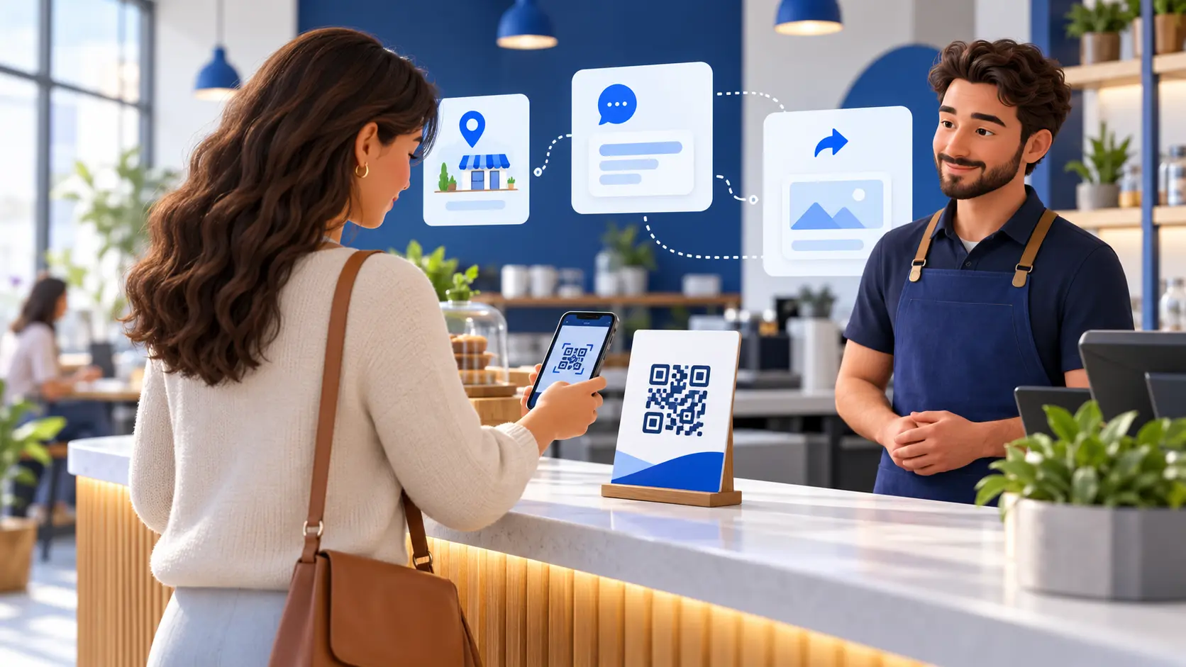
Start with the customer moment, not the QR code
A QR feedback sign succeeds when it appears at a moment when a customer has time, context and a reason to respond. Printing a large code and putting it wherever space is available may technically create access, but it does not create a useful feedback routine. A sign beside a payment terminal, reception desk or pickup counter has a different job from a sign on a waiting-room table. The first planning question is therefore not how big the code should be. It is what the customer is doing when they see it.
Map the end of the experience from the customer’s point of view. At a restaurant, that might include ordering, dining, paying and leaving. At a service counter, it might include checking in, waiting, receiving help and collecting an item. Choose a moment when scanning will not block a line, interrupt a sensitive conversation or compete with several other instructions. A clear moment reduces staff explanation and makes the invitation feel like part of the service rather than an extra demand.
ReviewDoctor lets a business create named QR stations for different counters, tables, areas or employees. That structure is most useful when the station name describes a real operational point, such as Front desk, Pickup counter or Table patio. Do not create ten station names that staff cannot distinguish. Start with the few locations where a different result would lead to a different action, then expand only when the team can maintain the signs and use the information.
Give every station a specific purpose
Write one sentence explaining why each station exists. For example: the pickup station helps the manager understand packaging, timing and handoff concerns; the reception station helps the office understand arrival instructions and wait communication. This purpose guides where the sign belongs, who should mention it and who owns the feedback. It also prevents the dashboard from filling with labels that have no operational meaning.
Use names that remain clear in a report. Counter 1 may make sense today, but Main checkout or East pickup window may be easier to recognize six months later. When a station represents an employee, explain the purpose and access rules to the team before displaying it. Avoid using a feedback program as a public staff-ranking system. The goal is to identify fixable experience patterns, not to assign blame from one comment or one scan.
Keep the station’s printed wording consistent with its destination. ReviewDoctor’s current station workflow supports downloadable QR images, printable sign designs, kiosk links and a testable customer page. If the sign says Share your experience, the page should immediately offer that experience. Do not place a feedback QR code under a headline that implies payment, check-in or Wi-Fi access. A customer should understand what will happen before opening the camera.
Place signs where scanning is physically comfortable
A good location keeps the sign visible without forcing the customer to reach across equipment, stand in a doorway or photograph a screen from an angle. Put a tabletop sign upright, provide enough light and leave clear space around the code. Avoid glossy covers that create glare, curved containers that distort the pattern and surfaces that are regularly hidden by menus, receipts or bags. If the sign moves during the day, assign a closing or opening check that returns it to the intended position.
Think about distance and phone movement. A small code on a wall across a lobby may be readable by the eye but awkward for a camera. A large sign directly beside a card reader may be too close to frame comfortably. Test the actual printed size from the position where a customer will stand or sit. Include people with different phone models and heights. A code that scans from the designer’s desk is not yet proof that it works at the counter.
Provide another route for people who cannot or prefer not to scan. Staff can offer the business’s normal contact channel, and a shared tablet can use ReviewDoctor’s station kiosk when that option fits the setting. Do not make a public QR sign the only way to raise an immediate service or accessibility concern. The sign should make feedback easier; it should not create a new barrier for a customer who needs help in another form.
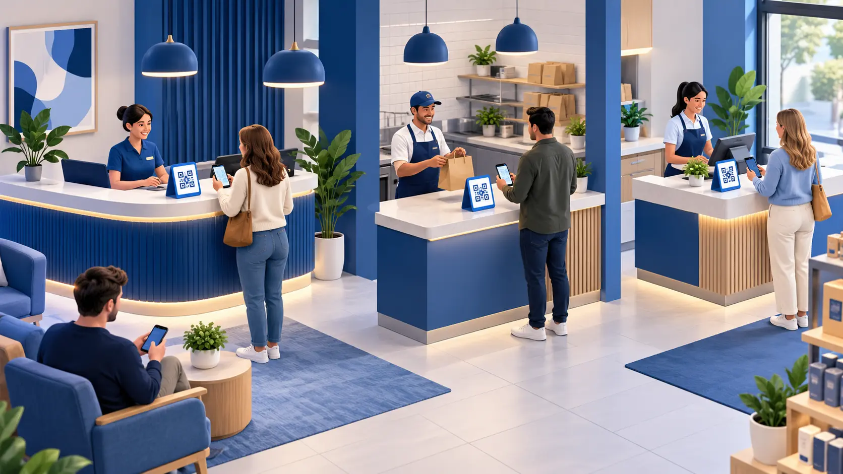
Use one neutral invitation for every customer
The headline should invite an honest experience rather than a desired score. Clear options include Share your experience, Tell us how your visit went or We welcome your feedback. Avoid Five-star reviews appreciated, Love us? Review us or language that asks only satisfied customers to continue. Google Maps policy prohibits merchants from discouraging negative reviews or selectively soliciting positive ones, so the invitation should not change according to how staff think the interaction went.
Google’s policy also prohibits offering incentives such as payment, discounts or free goods or services in exchange for posting, revising or removing a review. The Federal Trade Commission’s Consumer Reviews and Testimonials Rule separately prohibits compensation or incentives that are expressly or implicitly conditioned on a particular positive or negative sentiment. For Google review requests, the practical rule is simpler: do not attach a reward to the review. Keep loyalty points, coupons and drawings independent of public-review activity.
ReviewDoctor’s customer flow can make a Google review link and private feedback available without using the customer’s sentiment to decide who sees the public option. Keep that choice consistent. Private feedback is valuable because a customer may prefer to contact management directly, but it must not become a gate that prevents critical customers from reaching the same public-review invitation. Staff should describe both paths neutrally and let the customer choose.
Design the sign for quick understanding
A person should be able to understand the sign in a few seconds. Use a short headline, one supporting sentence and one clear action. Give the QR code generous white space and enough contrast. Keep decorative elements away from its edges. A business name or logo can establish trust, but it should not compete with the action. If the customer must read several paragraphs before learning what the code does, the design is asking too much of a busy moment.
Use type that remains readable at the intended distance. Small legal or explanatory text may look tidy in a browser preview and disappear on a five-by-seven print. Review the exported file at its actual size and print one sample before ordering a batch. Check color contrast in the room’s real lighting, not only on a bright monitor. If the sign will appear outdoors or near a window, test it at different times of day for glare and fading.
Add a plain-language cue such as Open your camera and scan when the audience may be unfamiliar with QR codes. Do not promise an outcome the page cannot deliver. A feedback sign should not say Instant help if no one monitors submissions in real time. If contact details are collected, explain their purpose on the customer page. The printed sign can stay concise while the destination provides the necessary context and choices.
Run a complete test before the sign goes public
Use ReviewDoctor’s station test page and scan the final printed sign with at least two phones. Confirm that the correct business and station appear, the customer page loads on cellular data as well as the business Wi-Fi, and the Google review link opens the intended Business Profile. Google’s current Business Profile help also allows eligible businesses to copy a review link or download a review QR code from the Read Reviews area; whichever destination you configure, verify it while signed out of the business account.
Submit one clearly labeled test private message and follow it through the staff workflow. Confirm that it appears under the correct station, that the responsible employee can access it and that the status can be updated. Remove or resolve the test according to your data process. Then test the kiosk link if the station will use a shared tablet. Rotate the device, enlarge text and confirm that the page remains usable with the browser controls visible.
Finally, inspect failure cases. Cover part of the code, dim the light and try an older phone. Check what happens when the network is slow or unavailable. Make sure staff know the fallback contact route. Record the test date and owner on an internal checklist. A sign should not be distributed to every location until one complete customer journey has worked from scan through staff follow-up.
Give staff a fifteen-second explanation
Staff do not need a sales pitch. A simple line is enough: We welcome honest feedback; you can scan this sign if you would like to share your experience. The invitation should be optional, delivered without hovering and used consistently according to the business’s written process. Employees should not ask what rating a customer plans to leave or suggest that a positive review helps them personally.
Teach the next step for private feedback. The employee mentioning the sign may not be the person who resolves a concern, but they should know who owns the inbox and when it is checked. If a customer raises an urgent issue face to face, staff should use the business’s normal escalation process rather than sending the person to a QR form. The sign supports service; it does not replace attentive staff or emergency procedures.
Include the invitation in onboarding and refresh it after any page or sign change. Role-play one customer who wants to leave a public review, one who prefers a private message and one who does not want to scan. The correct outcome in the third example is a polite end to the invitation. Consistent, low-pressure behavior protects the usefulness of the feedback and gives customers control over whether and how they participate.
Measure scans, clicks and feedback as different events
Do not treat every scan as a review. In ReviewDoctor, station analytics can distinguish QR scans, Google-link clicks and private feedback activity when the required analytics permission is present. A scan shows that the customer page was opened. A Google-link click shows that the customer chose to visit Google. Neither confirms that Google accepted or published a review. Private feedback is a separate submission to the business workflow.
Choose a management question before opening the dashboard. If one station receives scans but few completed actions, inspect the page wording, network and physical context. If another station receives no scans, check whether the sign is visible and whether staff mention it. Compare similar time periods and account for closures, moved signs or changing customer volume. A small count can change sharply from one week to the next, so avoid declaring success from a single percentage.
Add follow-up measures that reflect work the team controls, such as the number of private messages acknowledged within the internal target, open items by age and completed operational actions. Keep definitions stable. A Google-link click is not a posted review; a resolved private item does not mean the customer changed their public rating. Clear labels help a team learn from the process without turning partial signals into unsupported revenue or reputation claims.
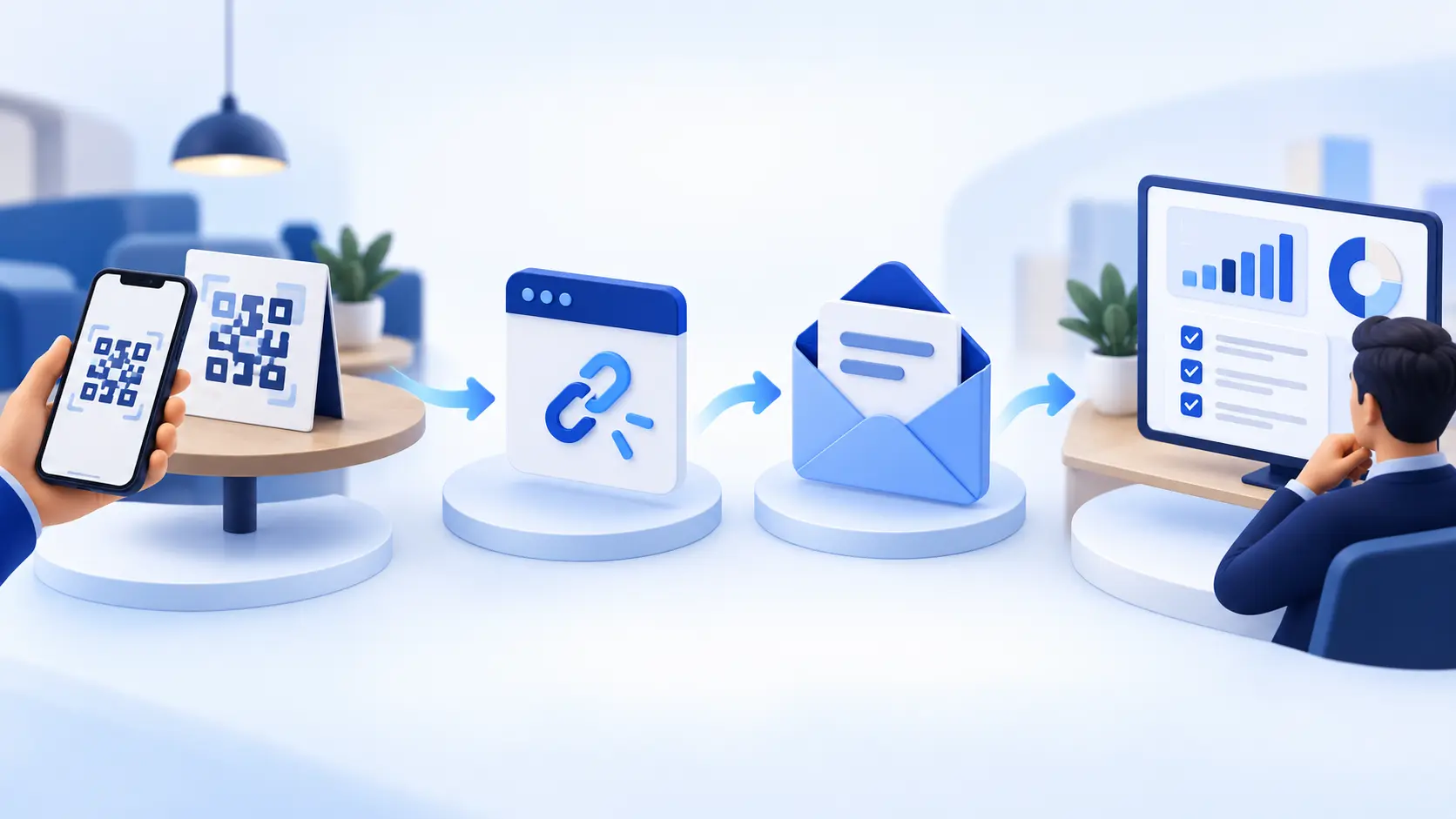
Hypothetical walkthrough: three signs, three decisions
Consider a hypothetical neighborhood business with a reception desk, a pickup counter and a checkout register. The manager creates three ReviewDoctor stations with those names and assigns an owner for each. The reception sign sits beside the departure path rather than the check-in paperwork. The pickup sign faces customers waiting for completed orders. The checkout sign sits beyond the card terminal so scanning does not slow payment. This example is invented and includes no customer result.
The team uses the same neutral headline on every sign but a small supporting line that matches the moment. Staff receive one sentence of guidance and the manager tests each final print on Wi-Fi and cellular data. After the first week, the manager does not rank employees by scan count. Instead, the team checks whether each sign remained visible, whether its link matched the station and whether any private messages reached the correct owner.
Suppose the pickup station has several scans and a repeated comment that collection instructions are unclear. The manager inspects the counter, updates the instruction sign and records the change date. The team then watches the same theme over time while keeping the public-review invitation unchanged. This walkthrough illustrates a responsible operating loop; it does not predict more reviews, a higher rating, shorter waits or additional sales.
Maintain every active sign as a live touchpoint
A QR sign can remain on a table long after the team member who created it has moved on. Keep an inventory of active stations, their physical locations, sign sizes, owners and last test dates. Retire duplicates and replace damaged prints. If a counter moves, update the station record and move the sign deliberately rather than allowing the dashboard label and physical location to drift apart.
Scan each active sign monthly and after any change to the business name, Google destination, subscription access or customer page. Confirm the page is mobile friendly, the station is correct and the public and private options remain available as intended. Review staff permissions and remove access that is no longer needed. Check that alerts or internal routines still reach the employee responsible for private feedback.
Treat exported signs as controlled copies. When a design or destination changes, identify where old prints may still exist: front desks, table stands, event kits, partner locations or saved PDF files. A redirectable station can preserve the destination, but an outdated message or damaged code still needs replacement. Record the new version date so staff can recognize the current print without guessing.
Use a thirty-day rollout instead of a one-day launch
During the first week, choose one or two high-value stations, define their purpose and test the complete journey. In the second week, train the employees who work closest to those signs and observe whether placement interferes with service. Correct practical problems before printing more copies. This staged approach makes a broken link, confusing label or glare problem a small fix rather than a location-wide cleanup.
In the third week, review the events separately: scans, Google-link clicks and private submissions. Read private comments through the authorized workflow and assign any service actions. Ask staff what customers found confusing. Do not rewrite the invitation to chase a particular rating or use an incentive to increase participation. Improve visibility, clarity and follow-through—the parts of the experience the business can responsibly control.
At the end of thirty days, decide whether to keep, move, revise or retire each station. Document one operational lesson and one maintenance task. Expand to another location only when an owner can repeat the test, training and response routine. ReviewDoctor can provide the station, signs, customer paths and activity measures, while the business remains responsible for its placement, wording, staff behavior, privacy choices and platform compliance.