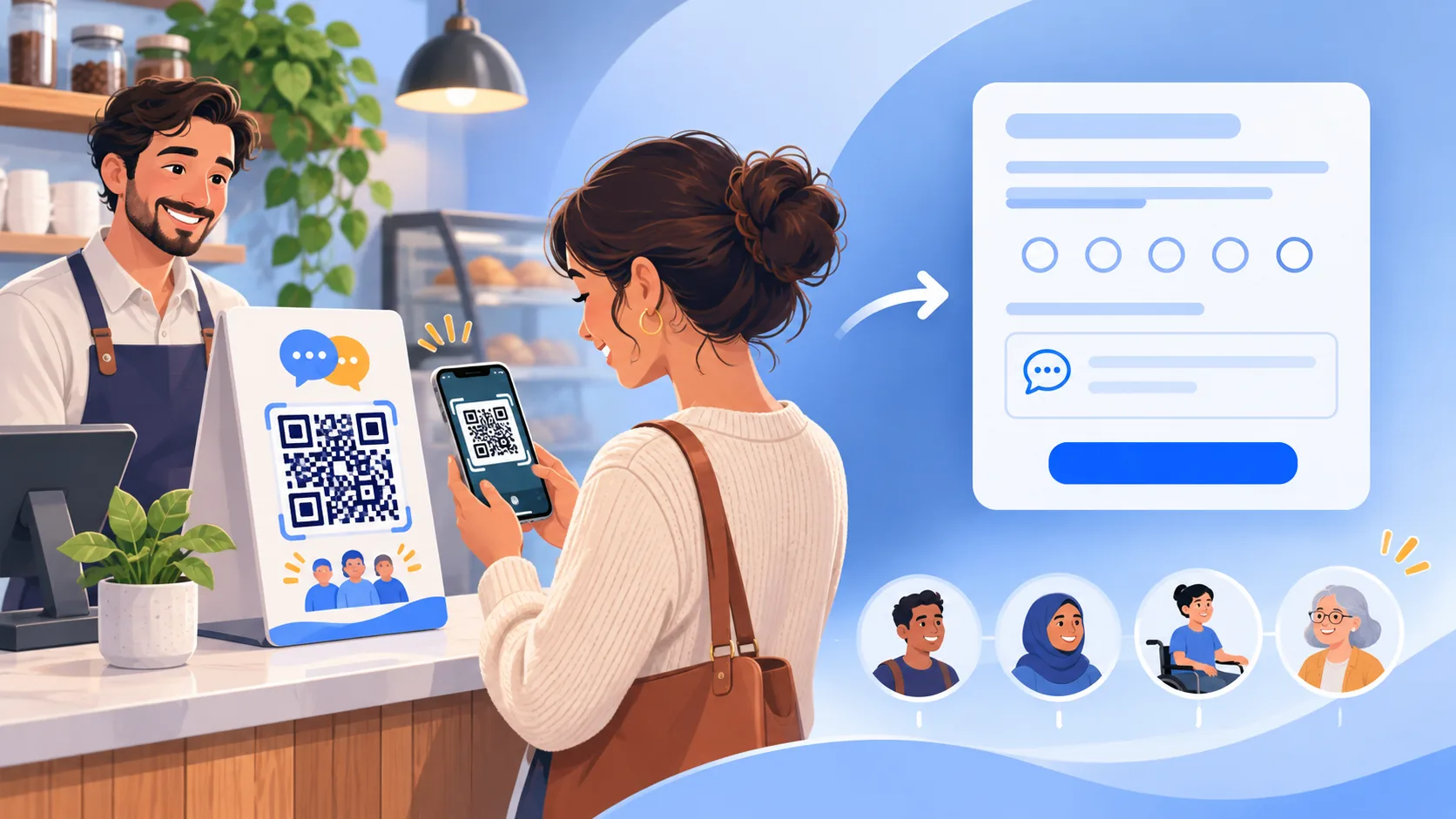
Start with the decision the feedback should improve
A QR code is only the doorway. The useful part is the decision a team can make after a customer submits the form. Before writing questions, choose one operating decision: improve the checkout handoff, find recurring cleanliness problems, understand appointment delays, fix menu confusion or learn why a guest needed assistance. A form that tries to measure every part of the business usually becomes long, vague and difficult to act on.
Write the decision in one sentence and assign an owner. For example: “The shift manager will review comments about wait time before the next weekly schedule is posted.” That statement identifies the topic, reviewer and time for action. It also exposes unnecessary questions. If age, home address or employer does not help the manager make that decision, do not ask for it.
A ReviewDoctor QR station gives each physical placement its own customer page and attribution. That makes it practical to separate a front desk, table tent or checkout counter without changing the underlying feedback purpose. Use station names that describe the placement internally. The public invitation should stay simple and should never suggest that only happy customers are welcome.
Choose a short question sequence that works on a phone
Start with one broad experience question, then offer one optional follow-up that helps the team understand the reason. A practical sequence is: overall experience, area that most influenced the visit, optional comment and optional contact choice for a reply. Four focused steps are often more useful than a long survey because the customer can see why each answer matters.
Use plain language. “What should we improve next time?” is clearer than “Please elaborate on service-quality deficiencies.” Answer choices should be mutually understandable and should include an option such as “Something else” when the list cannot cover every situation. Do not make a written comment mandatory unless the business truly cannot process the submission without it.
A rating can summarize a visit, but it should not replace the customer’s words. If the form uses a scale, label both ends and explain what the values mean. Avoid changing the meaning between pages. A five-point experience question and a ten-point recommendation question measure different things, so combining their results as if they were the same creates false precision.
Ask only for contact details that support a clear follow-up
Private feedback can be anonymous. If the team offers a response, explain that a name, email address or phone number is optional and used for that follow-up. Do not quietly turn a service-recovery field into a marketing subscription. Marketing, loyalty and future feedback invitations need their own purpose and consent where applicable.
Collect the minimum contact channel the team can actually monitor. Asking for both email and mobile number creates more sensitive data and more work. If the business cannot call after hours, say when a response can be expected instead of promising immediate contact. A confirmation page should tell the customer whether the message was received and what happens next.
ReviewDoctor keeps private feedback in the selected business workspace so an owner can assign a status and follow the issue through resolution. Business staff permissions and messaging consent remain separate. A QR submission should not grant broader access, enroll the customer in marketing or authorize future messages by implication.
Keep private feedback and public review requests ethically separate
A customer should not have to provide a favorable answer before seeing a public-review option. Google’s Maps policy prohibits merchants from discouraging negative reviews, selectively soliciting positive reviews, offering incentives for reviews, or pressuring people to include a particular rating or wording. A QR program should welcome honest experiences and keep the public choice available on neutral terms.
Do not use a prize, coupon or employee contest to push five-star reviews. The Federal Trade Commission’s Consumer Reviews and Testimonials Rule also addresses fake reviews, sentiment-conditioned incentives, insider reviews and review suppression. Platform policies can be stricter than a general legal rule, so the destination’s current rules control whether any incentive is allowed there.
Private service recovery still has an important role. A customer can send the business details that should not appear publicly, and the team can resolve the issue through an appropriate channel. That private path should be presented as help, not as a barrier that keeps an unhappy customer away from a public review site.
Write the physical call to action before designing the sign
The sign should answer three questions in a glance: what will happen, how long it takes and who receives the message. “Scan to share private feedback with our manager” is more informative than “Scan me.” Add a short alternative URL when space allows so a customer who cannot use the camera still has a route.
Match the invitation to the setting. A table tent can mention the visit. A hotel room card can point to guest assistance. A dental checkout sign can ask about scheduling and comfort without requesting clinical details. Keep the QR code large, high contrast and surrounded by clear space. Do not place essential instructions inside the code or cover its finder patterns with decoration.
Test the exact printed size, material, lighting and distance. A QR image that scans from a desktop preview may fail on a glossy counter card under overhead light. Test with more than one phone and with the destination logged out. The person approving the print should verify the visible domain and the final destination, not only the appearance.
Make the mobile form accessible and forgiving
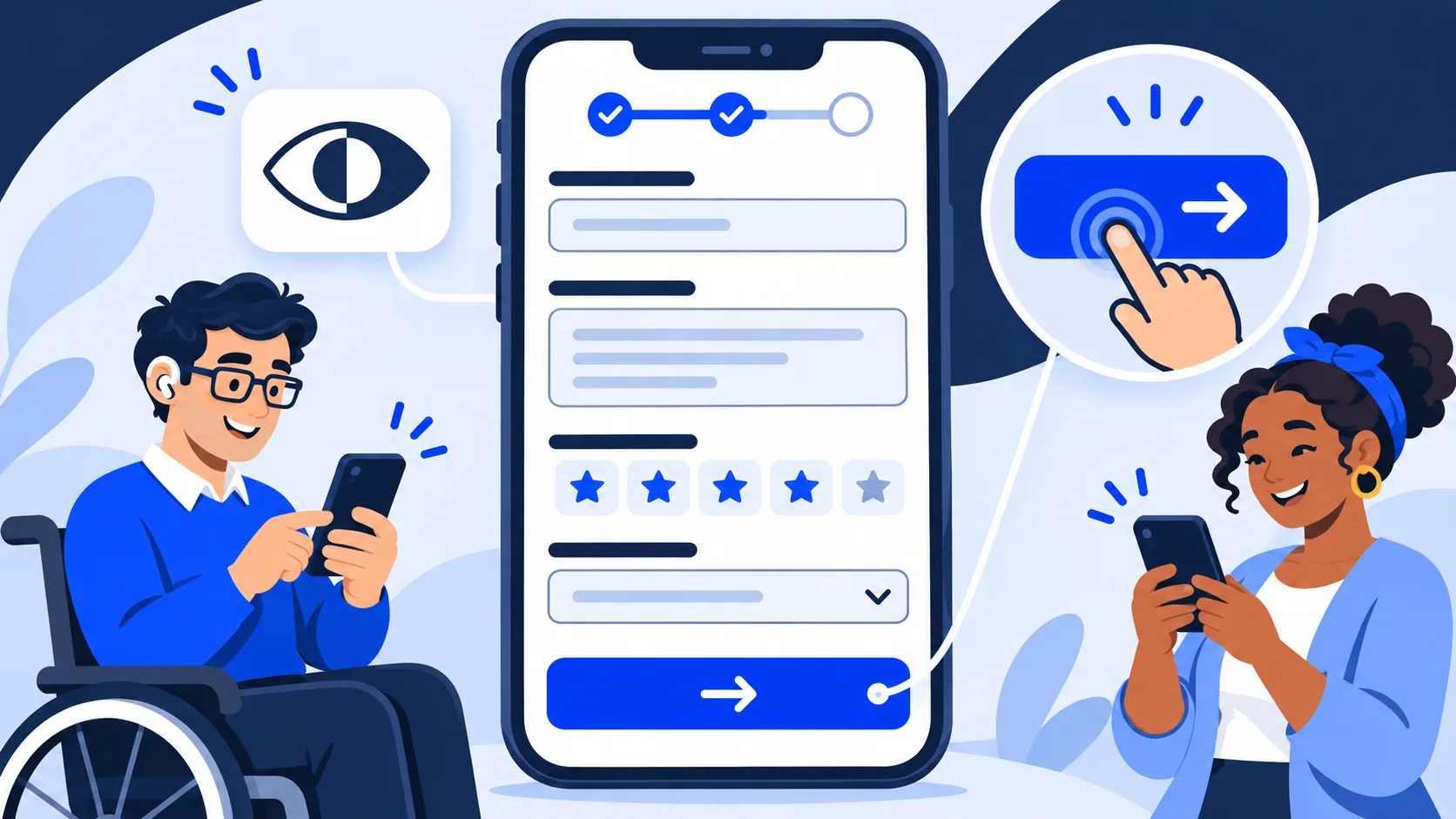
A feedback form is often opened while the customer is standing, carrying a bag or using one hand. Use a single-column layout, readable type, large tap targets and sufficient contrast. Keep labels visible instead of relying on placeholder text that disappears when typing. W3C’s Web Accessibility Initiative recommends associating labels with every form control so browsers and assistive technology can identify each field.
Error messages should say what happened and how to fix it. W3C guidance recommends clear overall feedback plus specific messages near the relevant controls. Do not communicate an error only with color. Move focus to a useful summary or the first invalid field, preserve answers already entered and make the customer correct only the actual problem.
Support keyboard navigation, browser zoom and screen readers. Avoid a time limit unless it is necessary, and warn before a session expires. A successful submission needs a clear confirmation. The form should remain usable when an animation fails or the connection is slow; decoration should never be required to understand the questions.
Protect the QR code from replacement and confusing redirects
A printed QR code can remain in place for months, which makes physical inspection part of the security plan. Record where each sign is installed, use tamper-resistant placement when appropriate and ask staff to look for stickers placed over the original. Re-scan a sample during regular opening or closing checks.
Use an HTTPS destination on a recognizable business domain and minimize redirect chains. A short branded link can help a customer inspect the destination before continuing. CISA phishing guidance advises people to be cautious with unexpected links and requests for personal information; a clear domain and modest data request reduce the signals that make a legitimate feedback page look suspicious.
Do not encode passwords, employee-only links or administrative tokens in a public sign. The QR destination should be safe to share. If the link must change, use a controlled redirect that preserves the station identity, and test the previous printed code after every change.
Design the team workflow before inviting submissions
Decide who checks the inbox, how often and what counts as urgent. A basic triage can separate safety or privacy concerns, unresolved service issues, general suggestions and praise. Define who may contact the customer and which verified channel to use. Public replies, refunds and incident investigations should follow separate authorization rules.
Use statuses that describe the next action: new, reviewing, waiting for customer, assigned, resolved or closed without follow-up. A status is not proof that the customer agrees with the outcome. Add an internal note that records what the team did without copying unnecessary personal details into multiple systems.
Set a realistic response target based on staffing. If the page promises a reply in one business day, the weekend and holiday process must support it. When no response is promised, the confirmation can still explain that the feedback will be reviewed. A reliable modest promise is better than an instant-response claim that the team cannot keep.
Measure scans, visits, feedback and link clicks as different events
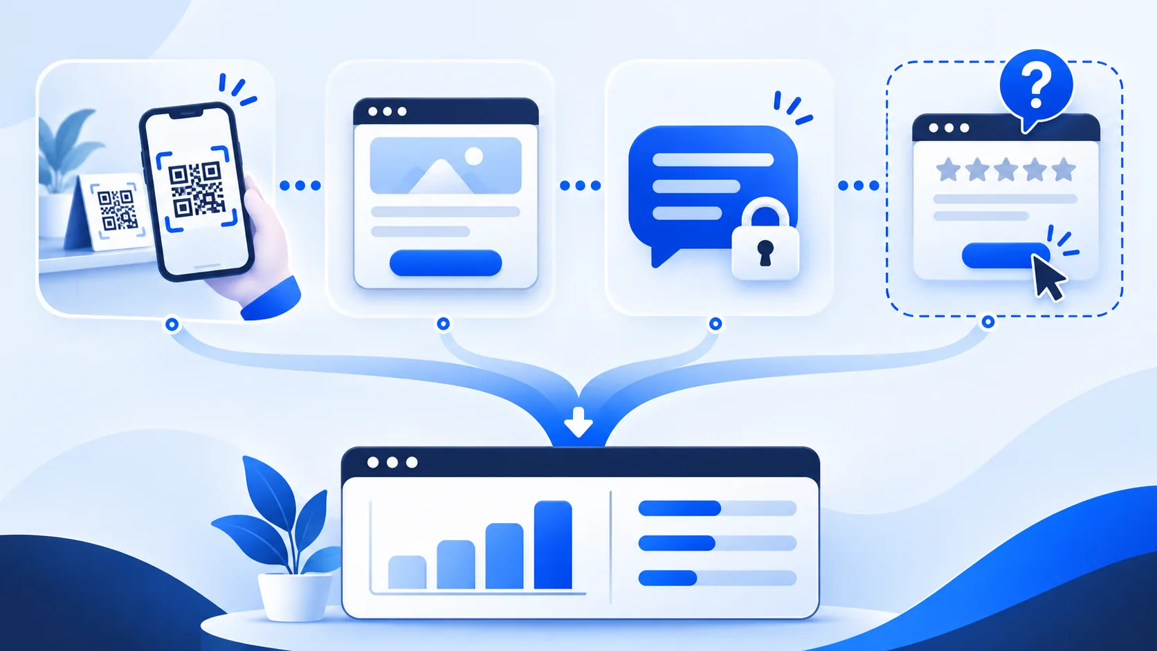
A scan, page visit, submitted private message and outbound review-link click answer different questions. A scan indicates that the QR destination was opened or attempted. A page visit shows the landing experience loaded. A private submission records a completed message. An outbound click shows that the customer selected a link; it does not prove that a public review was written or published.
ReviewDoctor’s business insights keep feedback QR visits, private feedback and Google-link taps as separate recorded activity. QR events can be deduplicated by station and a visitor identifier, but they are not verified unique people. Google-link taps are not completed-review counts. Use these measures to find broken handoffs or underused placements, not to claim sales, rankings or reviews that the system cannot verify.
Compare like with like. A lobby sign and a receipt QR code have different opportunities to be seen. Track the placement, date range and any design change, then look for a sustained pattern. Do not declare a winner after a small number of events or after changing the sign, question wording and staff script at the same time.
Run a controlled test instead of redesigning everything at once
Choose one variable: call-to-action wording, sign placement, first question or page load performance. Keep the destination and operating process stable for the test period. Record the start date, locations involved and the decision rule before looking at results. This makes the next change easier to explain.
Check qualitative signals alongside counts. If scans rise but messages say the form is confusing, the new sign may be attracting attention without improving the experience. If private submissions fall after a shorter form is introduced, verify that tracking still works and that the questions still feel relevant before assuming customer satisfaction improved.
Stop a test when the QR code is damaged, the location changes, a technical fault appears or the wording could mislead customers. Operational integrity is more important than completing an arbitrary test window. Keep the previous design available so the team can restore a known working version.
Hypothetical walkthrough: a three-location café group
Consider a hypothetical café group with three locations. This example is an operating model, not a real ReviewDoctor customer case study, and it reports no measured result. The owner creates separate stations for the register and pickup shelf at each café. The form asks about the visit, the area that most influenced it and one optional comment. Contact information is optional and used only when the customer requests a reply.
Each location manager reviews new private feedback during opening and closing routines. Safety or allergy comments go to the regional operator immediately; order accuracy goes to the shift lead; general suggestions enter a weekly review. The public-review link is offered neutrally, without a discount, staff quota or requirement to choose a positive rating.
For four weeks, the group tests only the pickup-shelf sign wording. It compares page visits with completed private feedback by placement and checks comments for confusion. Google-link clicks remain a separate count and are never reported as posted reviews. At the end, the owner keeps the clearer invitation, documents the decision and schedules a monthly physical QR inspection.
Use a launch checklist that protects customers and the team
Before printing, confirm the destination, business name, station, form purpose, privacy language, accessibility basics and inbox owner. Scan every design from the final proof. Confirm the page works over mobile data, the submission confirmation appears, errors are understandable and the team receives the message in the correct workspace.
Before inviting public reviews, review the destination’s current policies. Remove sentiment filters, incentives, employee quotas and requests for specific wording. Train staff to invite honest feedback in the same neutral way. Give them a short script and a clear answer for customers who prefer not to scan.
After launch, inspect the sign, destination and inbox on a schedule. Review unresolved items, access permissions, broken links and stale instructions. A QR feedback form succeeds when it shortens the distance between a real customer experience and a responsible operating decision—not when it merely produces a larger scan count.