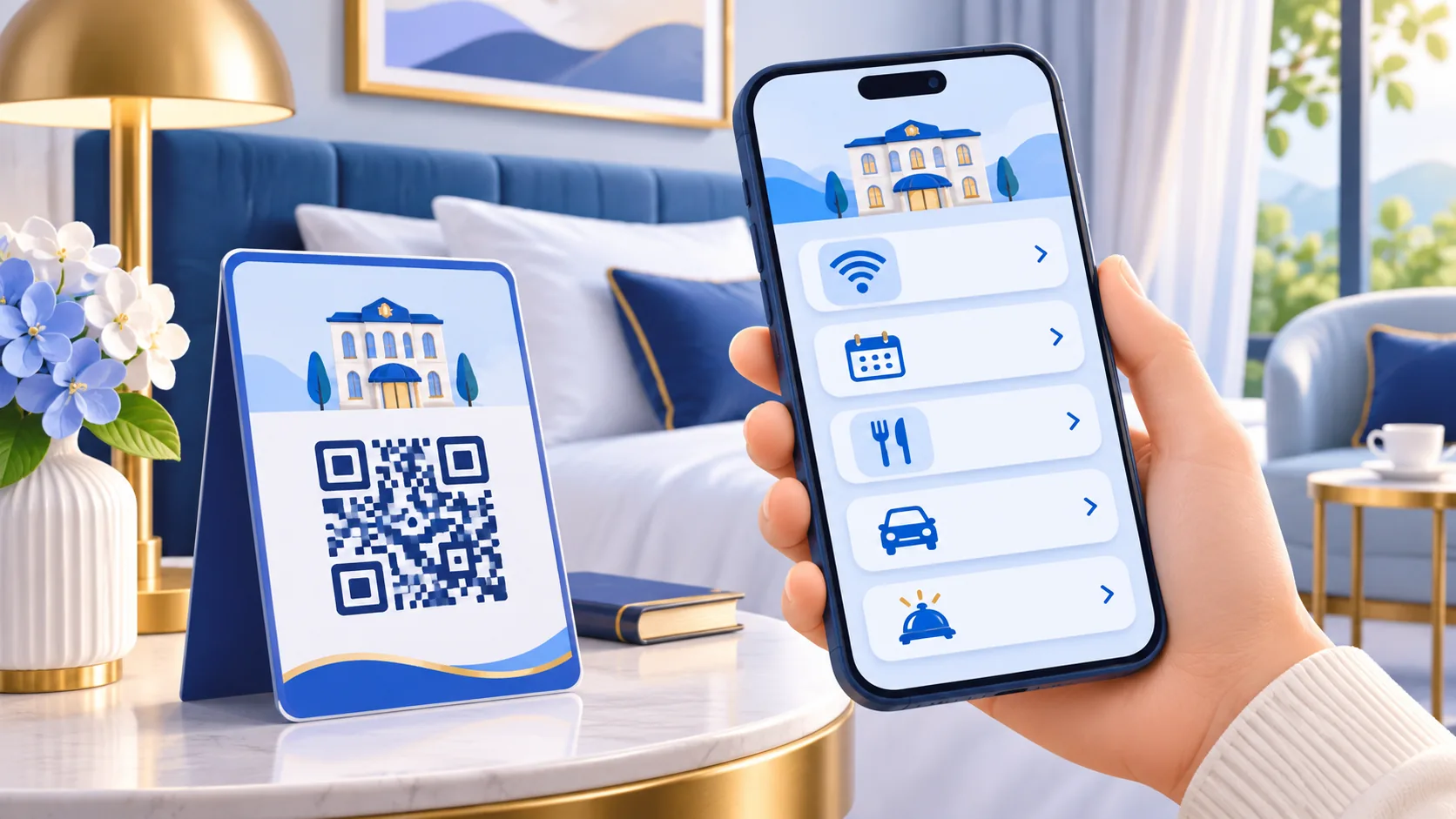
A hotel QR guide is an operating surface, not a digital brochure
A guest who scans a code in a hotel room is usually trying to complete a task. They may need the Wi-Fi name, breakfast hours, a checkout instruction, a parking answer or a way to ask for help. The guide earns its place when it puts those answers within a few taps. A long welcome message, a rotating promotion and a list of every amenity can all be accurate while still making the immediate answer difficult to find.
Treat the guide as a small, guest-facing operating surface. Each item should answer a real question, point to a working next step or set an expectation the hotel can meet. That standard changes the planning conversation. Instead of asking what content the hotel has available, ask which questions recur at the desk, on the phone and in room-service conversations. Then decide which answers are stable enough to publish and who owns each answer when it changes.
This guide describes a practical workflow for independent hotels, motels and small hospitality groups. It does not promise fewer calls, higher ratings or more bookings. Those outcomes depend on the property, staffing and execution. The aim is simpler: publish a useful mobile guide, test it in the places guests will scan it, and keep the information dependable throughout the stay.
Start with the five questions guests need first
Begin with a short inventory of essential stay information. For many properties, the first group is Wi-Fi access, checkout time and instructions, breakfast hours and location, parking or valet details, and a clear route to the front desk. Your property may have a different fifth item. An airport hotel may prioritize shuttle times, while a resort may place pool hours or a property map near the top. The order should follow guest urgency, not the hotel’s department chart.
Write each answer as a compact service card. Give it a plain label, the current answer and one useful action. A parking card might identify where overnight guests may park, the current fee and how to request help. A breakfast card might state the serving location and separate weekday from weekend hours. If the answer depends on the reservation, room type or date, say that and direct the guest to an appropriate staff channel rather than publishing an overly broad promise.
Put emergency information and legally required notices in the channels your property has approved for those purposes. A QR guide can make important resources easier to reach, but it should not replace required in-room postings, evacuation diagrams, accessible communication procedures or direct staff assistance. Review the final content with the people responsible for operations, safety and accessibility before launch.
Create a content map before designing the screen
A useful content map separates immediate stay essentials from optional discovery. The first layer should answer tasks that affect the guest now: connect, leave, eat, park and get help. A second layer can cover housekeeping, fitness, pool, pets, accessibility, transportation and other property services. A third layer can introduce dining and local recommendations. This order prevents a promotional card from pushing checkout instructions below several screens of content.
For every proposed card, record four fields in an internal worksheet: the guest question, the published answer, the staff owner and the next review date. Add the source of truth when one exists, such as a current operations sheet or approved service schedule. If two departments provide different answers, resolve the difference before publishing. The guest guide should not become another place where an old copy of the policy survives.
Keep the visible language specific without becoming dense. Replace a heading such as “Information” with “Checkout,” and replace “Contact us for assistance” with the actual supported action, such as calling the front desk or submitting a guest-assistance request. Avoid placing essential details only inside a downloadable PDF or image. Text in the page is easier to resize, update, translate and read with assistive technology.
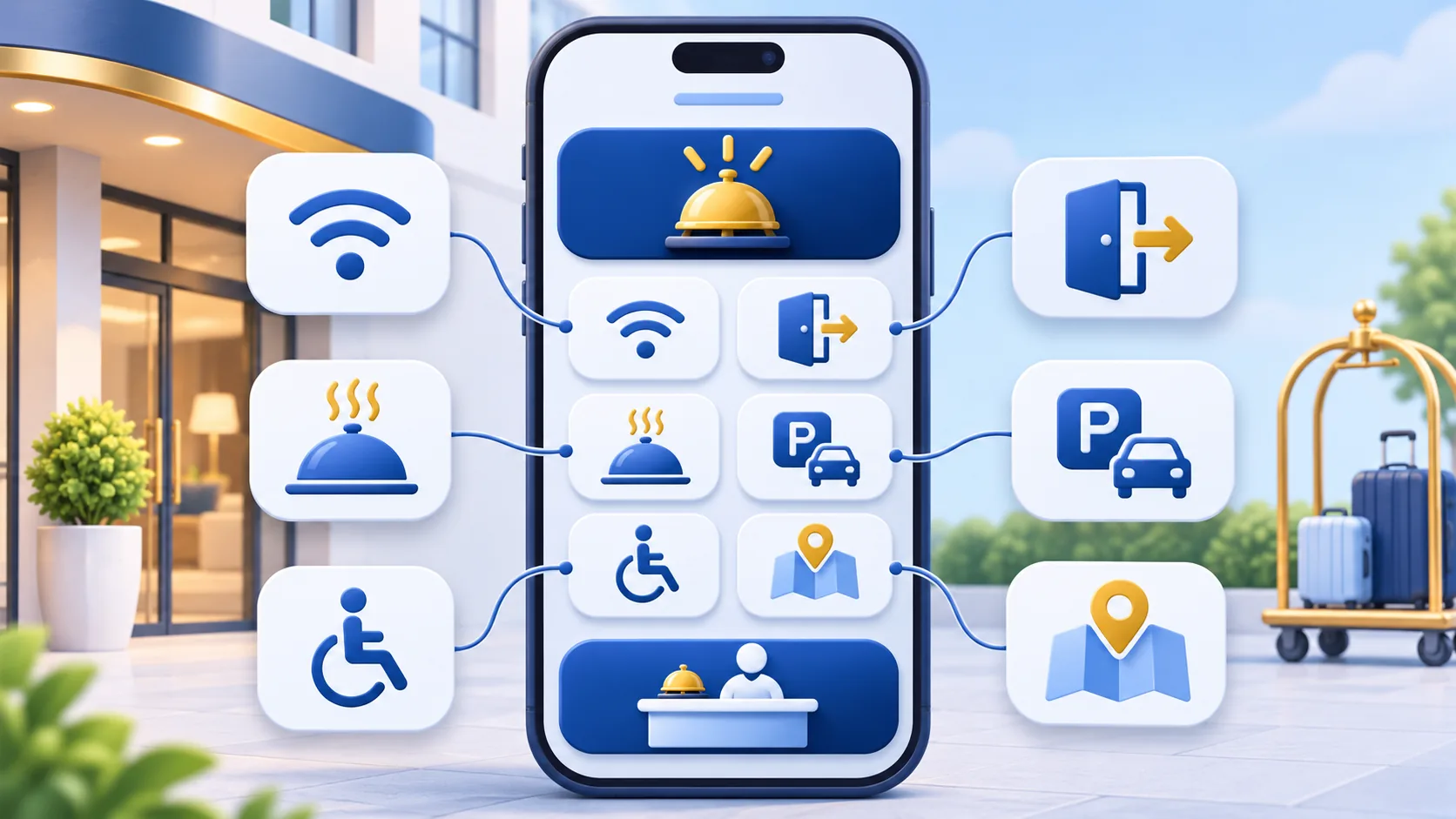
Design the first screen around scanning intent
A room placard and a lobby sign can point to the same guide, but the likely intent may differ. A guest scanning beside the bed may be looking for Wi-Fi, checkout or an in-room request. Someone scanning near the entrance may need parking, check-in or directions. If the platform supports labeled placements, use them to organize your own testing plan. Do not assume that the room number or sign location verifies a person’s identity or authorizes access to a room.
The first screen should establish trust quickly. Show the property’s current logo or name, use the hotel’s approved colors, and keep the most useful cards visible without a long introduction. A white-label guest guide can feel like part of the hotel’s service when the identity, tone and contact routes match the rest of the stay. Avoid adding unrelated vendor branding that makes a guest wonder whether the QR code has sent them to an advertising page.
Use a short page title and make the navigation predictable. If the interface uses swipeable information panels, show a visible position indicator and keep essential facts available through labeled cards as well. Do not require a guest to discover a hidden gesture to find checkout or contact information. Test the page one-handed on a smaller phone and at increased text size before approving the layout.
Explain guest Wi-Fi without promising an automatic connection
A hotel guide can display a configured network name and password, open a supported Wi-Fi flow or link to a compatible captive portal. A normal web page cannot by itself authorize internet access on the property’s router. State what the guest should expect after tapping. If the next step is to copy a password and open phone settings, say so. If the property uses a supported captive portal, test that exact integration on the production guest network.
Keep access to Wi-Fi separate from optional marketing permission. A guest who declines offers should still receive the same configured connection path when Wi-Fi is part of the stay. Explain any required guest-network terms in plain language and provide a clear choice. Do not make the primary connection button imply that promotional messages are required when they are not.
Review Wi-Fi details whenever the network name, password, hardware or captive portal changes. Test with at least one current iPhone and Android device, with cellular data temporarily disabled so a false positive is easier to spot. Confirm what happens after a guest copies the password, leaves the browser and returns. A support instruction is useful only when staff recognize the same screens the guest sees.
Make checkout, parking and service details operationally complete
Checkout information needs more than a time. Tell the guest whether keys stay in the room, go to a box or return to the desk; how to request a late checkout; and whether a receipt arrives electronically or at the desk. Do not publish a late-checkout promise if availability must be confirmed. Google Business Profile also allows verified hotels to maintain check-in and checkout times, so include that profile in the property’s accuracy review rather than letting the website and profile drift apart.
Parking information should identify the correct entrance, current price, payment process, height or vehicle restrictions when relevant, and an assistance contact. If self-parking and valet follow different rules, show them separately. Avoid a vague map pin that leads a driver to the front door while the garage entrance is on another street. Test the directions from outside the property rather than from a phone already standing in the lobby.
Housekeeping, towels, maintenance, luggage storage and transportation requests need an owner and a response expectation. A guest-assistance form should make clear what happens after submission and should avoid asking for information the team does not need. A room label can help route the request, but it is context rather than identity proof. Urgent or emergency situations should direct guests to the property’s approved immediate contact path.
Build accessibility into cards, controls and language
The World Wide Web Consortium’s WCAG 2.2 guidance says information should not rely on color alone and provides minimum contrast criteria for text. Apply those principles to the hotel guide. Pair icons with labels, keep body text readable against its background and avoid pale text over a photograph. An icon can support recognition, but a bed, bell or car symbol may not communicate the same meaning to every guest without a plain label.
WCAG 2.2 also includes a minimum target-size criterion of 24 by 24 CSS pixels, with specified exceptions and spacing alternatives. In practice, hotel cards and primary actions can be comfortably larger than that minimum. Give each action a clear hit area and enough separation from adjacent controls. This helps guests using a thumb, guests with reduced dexterity and anyone scanning while handling luggage.
Use descriptive link text such as “Call the front desk” or “Open parking directions” instead of repeated “Learn more” labels. Provide text alternatives for informative images and treat decorative imagery as decorative. Check zoom, text resizing, landscape orientation and screen-reader order. Accessibility testing should include people and devices representative of the property’s guests whenever possible, not only an automated score.
Choose local recommendations the hotel can stand behind
Local recommendations can make a guest guide more useful, but they require ownership. Decide whether the hotel will list a small curated set, link to a trusted local destination resource or maintain categories such as dining, pharmacies and transportation. Record when each recommendation was last checked. Hours, reservation requirements, seasonal closures and accessibility information can change without notice.
Describe the relationship accurately. If a placement is sponsored or earns an affiliate commission, disclose that in a way guests can understand. Do not present a paid placement as an independent staff favorite. If the hotel has no commercial relationship, a simple factual description is usually more useful than an exaggerated endorsement. Avoid copying images or descriptions without the necessary rights.
ReviewDoctor’s hotel guide lets the property configure its own service and recommendation cards. It does not automatically pull Tiqets inventory or synchronize a property-management system. That boundary matters for maintenance: the hotel remains responsible for selecting the links, confirming that they work and removing stale recommendations. A guest guide should never imply real-time availability unless a verified real-time source supports that claim.
Protect trust at the physical QR sign
A QR code is a doorway, and the physical sign is part of the security model. The Federal Trade Commission warns that scammers can cover legitimate QR codes with their own and recommends checking the destination preview for misspellings or switched letters. Give guests a recognizable destination by printing the hotel name and a short, human-readable web address near the code. The visible address also gives staff a simple reference when inspecting the sign.
Place signs where guests expect hotel information and where staff can inspect them. Use a tamper-evident or protected holder when practical. Add QR inspection to the room-turn or public-area checklist: look for stickers, damaged print, altered branding or a destination preview that does not match the approved domain. Replace worn signs rather than relying on a code that scans only from a perfect angle.
Test the printed artifact, not only the file on a computer. Scan at the expected distance under room lighting with multiple phone cameras. Keep enough quiet space around the code, avoid glare and do not place a decorative logo over so much of the pattern that reliability falls. A stylized code can still be branded, but successful scanning and a trustworthy destination take priority over decoration.
Use a verify, update, test and publish routine
Assign one operational owner for the guide and named contributors for departments that supply information. The owner coordinates publication; contributors confirm facts. A practical change record includes the affected card, old wording, new wording, source, approver and effective date. That record helps the team answer why information changed without turning the public guide into a policy archive.
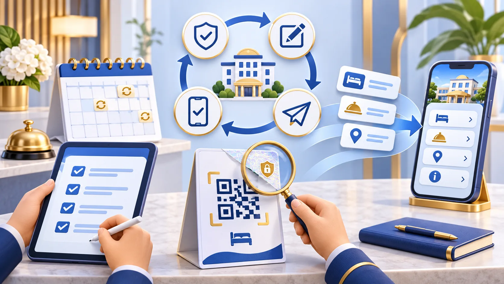
Use four steps for each change. Verify the operational decision with its owner. Update the guide and any other public channel that carries the same fact. Test the published path on a phone, including links and contact actions. Then publish or confirm the live version and note the next review date. For a time-bound change, schedule both the start and removal so a holiday breakfast schedule does not remain visible in January.
Set review frequency by volatility. Wi-Fi credentials and temporary closures need a review whenever they change. Breakfast hours, shuttle schedules and parking fees may justify a monthly or seasonal check. Stable accessibility contacts and emergency instructions still deserve a scheduled verification. The right cadence is the one the property can own consistently, with immediate updates for material changes.
Hypothetical walkthrough: a 48-room independent hotel
Consider a fictional 48-room hotel preparing a guide for room placards. This example is not a ReviewDoctor customer case study and contains no measured results. The team reviews repeated questions from its front desk and selects five top cards: Wi-Fi, checkout, breakfast, parking and guest assistance. It adds secondary cards for housekeeping, accessibility, nearby dining and directions. The operations manager is the guide owner; department leads are responsible for confirming their cards.
Before launch, the team discovers that the printed parking instruction names the front entrance while the garage entrance is around the corner. It corrects the guide, creates a direct map link to the garage and asks an employee unfamiliar with the setup to follow the instruction from the street. It also changes the Wi-Fi card from “Tap to connect” to a more accurate sequence that tells the guest to copy the password and open device settings.
The hotel prints a branded room placard with the property name, approved domain and a short invitation to scan. Staff test the actual sign in a dim room and inspect the destination preview. The manager schedules a monthly information review and a separate check before seasonal hours change. This walkthrough demonstrates the workflow only. It does not claim the guide reduced desk calls, improved reviews or changed guest satisfaction.
Measure usefulness without pretending a visit is a guest outcome
Start with operational evidence the team already sees: which questions still arrive at the desk, which published links fail during testing, which service cards produce unclear requests and which information changes most often. A scan or page visit, if the property measures it with appropriate permission, shows interaction rather than understanding. It does not prove that a unique guest found the answer, used a service or had a better stay.
Use a short monthly review to convert observations into changes. If guests repeatedly ask where breakfast is served, the card may need a location rather than more promotional copy. If staff receive assistance requests with too little context, refine the allowed request choices without collecting unnecessary personal information. If a card rarely matters but occupies the first screen, move it below the immediate essentials and test the new hierarchy.
Keep review activity separate from service access. Do not restrict hotel information based on feedback, steer only satisfied guests toward a public review site or offer a benefit in exchange for posting, changing or removing a review. The guide can provide honest service information and a separate, neutral way to share feedback. No guide design guarantees a rating, ranking or review outcome.
A practical prelaunch checklist
Content check: confirm the property name, phone numbers, Wi-Fi steps, check-in and checkout times, breakfast details, parking price and entrance, service hours, accessibility contact, emergency wording and local links. Make sure conditional services are described as conditional. Remove placeholders, sample room details and expired seasonal notices. Ask each operational owner to approve the facts they control.
Experience check: scan every sign with current iPhone and Android devices, follow every link, test call and assistance actions, increase text size, zoom the page, rotate the phone and navigate with a screen reader. Confirm that essential tasks have clear labels and sufficiently large controls. Check the page on a slow connection and make sure compressed images do not delay the first useful information.
Operations check: name the guide owner, set review dates, document the approved destination domain, store the current sign artwork and define how staff report a damaged or altered code. Train the front desk on what the guide can and cannot do. A ReviewDoctor hotel guide can present branded stay information, room QR signs and guest-assistance requests; it does not issue room keys, verify guest identity, control a router, sync a PMS or guarantee third-party availability.
Keep the guide simple enough to stay true
The best hotel QR guide is not necessarily the one with the most cards. It is the one whose first screen answers the questions that matter now, whose actions match real staff workflows and whose owner can keep every promise current. A smaller guide with accurate Wi-Fi, checkout, parking and assistance information is more useful than an ambitious portal filled with links nobody reviews.
Build the first version around one complete guest journey: scan a trusted sign, recognize the hotel, find an essential answer, take a supported action and know what happens next. Then add services only when the property has an owner, an accurate source and a maintenance plan for each one. This creates a guide that can grow without becoming a second, forgotten website.
ReviewDoctor provides the structure for a branded hotel guest portal, swipeable information panels, service and recommendation cards, room QR signs and a private guest-assistance inbox. The hotel supplies the identity, facts and operating decisions. That division is healthy: software can make information easier to publish, while the property remains accountable for what guests see and what staff deliver.